The fund outperformed slightly in September
Click for Big
Click for Big
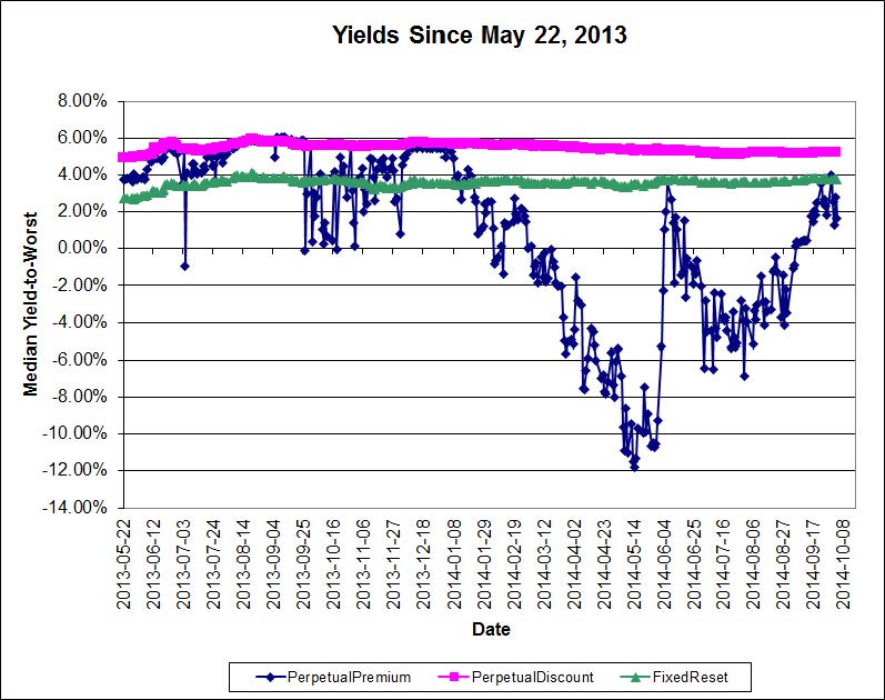
I continue to believe that the decline in the preferred share market remains overdone; the following table shows the increase in yields since May 22, 2013, of some fixed income sectors:
| Yield Changes May 22, 2013 to October 3, 2014 |
|||
| Sector | Yield May 22 2013 |
Yield September 30 2014 |
Change |
| Five-Year Canadas | 1.38% | 1.63% | +25bp |
| Long Canadas | 2.57% | 2.67% | +10bp |
| Long Corporates | 4.15% | 4.20% | +5bp |
| FixedResets Investment Grade (Interest Equivalent) |
3.51% | 4.88% | +137bp |
| Perpetual-Discounts Investment Grade (Interest Equivalent) |
6.34% | 6.72% | +38bp |
| The change in yield of PerpetualDiscounts is understated due a massive influx of issues from the PerpetualPremium sub-index over the period, which improved credit quality. When the four issues that comprised the PerpetualDiscount sub-index as of May 22, 2013 are evaluated as of September 30, 2014, the interest-equivalent yield is 7.30% and thus the change is +96bp. | |||
ZPR, is an ETF comprised of FixedResets and Floating Rate issues and a very high proportion of junk issues, returned +%, +% and +% over the past one-, three- and twelve-month periods, respectively (according to the fund’s data), versus returns for the TXPL index of -0.79%, +0.26% and +4.78% respectively. The fund has been able to attract assets of about $1,074-million since inception in November 2012; AUM increased by $19-million in September; given an index return of -0.79% a decrease of $8-million was expected, indicating that money is still flowing into the fund. I feel that the flows into and out of this fund are very important in determining the performance of its constituents.
TXPR had returns over one- and three-months of -0.62% and +0.38%, respectively with CPD performance within expectations.
Returns for the HIMIPref™ investment grade sub-indices for September were as follows:
| HIMIPref™ Indices Performance to September 30, 2014 |
||
| Sub-Index | 1-Month | 3-month |
| Ratchet | N/A | N/A |
| FixFloat | -1.09% | +3.75% |
| Floater | +1.64% | +1.52% |
| OpRet | +0.00% | +0.33% |
| SplitShare | +0.32% | +1.20% |
| Interest | N/A | N/A |
| PerpetualPremium | +0.13% | +1.12% |
| PerpetualDiscount | -0.85% | +0.88% |
| FixedReset | -0.64% | -0.03% |
| DeemedRetractible | -0.21% | +0.62% |
| FloatingReset | +0.38% | +1.37% |
Malachite Aggressive Preferred Fund’s Net Asset Value per Unit as of the close September 30, 2014, was $10.4601 after a dividend distribution of 0.129948.
| Returns to September 30, 2014 | ||||
| Period | MAPF | BMO-CM “50” Index | TXPR Total Return |
CPD – according to Blackrock |
| One Month | -0.66% | -0.76% | -0.62% | N/A |
| Three Months | +0.02% | -0.11% | +0.38% | N/A |
| One Year | +9.64% | +4.14% | +5.48% | +4.96% |
| Two Years (annualized) | +4.09% | +2.31% | +2.21% | N/A |
| Three Years (annualized) | +6.88% | +3.67% | +3.62% | +3.14% |
| Four Years (annualized) | +5.84% | +4.72% | +4.03% | N/A |
| Five Years (annualized) | +7.71% | +5.74% | +5.00% | +4.36% |
| Six Years (annualized) | +15.27% | +6.48% | +5.67% | |
| Seven Years (annualized) | +12.35% | +4.50% | +3.59% | |
| Eight Years (annualized) | +10.89% | +3.66% | ||
| Nine Years (annualized) | +10.33% | +3.70% | ||
| Ten Years (annualized) | +10.00% | +3.85% | ||
| Eleven Years (annualized) | +10.49% | +3.96% | ||
| Twelve Years (annualized) | +12.13% | +4.22% | ||
| Thirteen Years (annualized) | +10.73% | +4.15% | ||
| MAPF returns assume reinvestment of distributions, and are shown after expenses but before fees. | ||||
| CPD Returns are for the NAV and are after all fees and expenses. | ||||
| * CPD does not directly report its two- or four-year returns. | ||||
| Figures for National Bank Preferred Equity Income Fund (formerly Omega Preferred Equity) (which are after all fees and expenses) for 1-, 3- and 12-months are -0.28%, +0.55% and +5.72%, respectively, according to Morningstar after all fees & expenses. Three year performance is +4.02%; five year is +5.33% | ||||
| Figures for Jov Leon Frazer Preferred Equity Fund Class I Units (which are after all fees and expenses) for 1-, 3- and 12-months are -0.69%, -0.30% and +2.33% respectively, according to Morningstar. Three Year performance is +1.26%; five-year is +2.61% | ||||
| Figures for Manulife Preferred Income Fund (formerly AIC Preferred Income Fund) (which are after all fees and expenses) for 1-, 3- and 12-months are -1.07%, +0.15% & +3.07%, respectively. Three Year performance is +1.48%; five-year is +2.91% | ||||
| Figures for Horizons AlphaPro Preferred Share ETF (which are after all fees and expenses) for 1-, 3- and 12-months are -0.42%, +0.47% & +5.49%, respectively. Three year performance is +4.49% | ||||
| Figures for National Bank Preferred Equity Fund (formerly Altamira Preferred Equity Fund) are -0.56%, +0.20% and +4.01% for one-, three- and twelve months, respectively. | ||||
| The figure for BMO S&P/TSX Laddered Preferred Share Index ETF is -0.78%, +0.21% and +4.27% for one-, three- and twelve-months, respectively. | ||||
| Figures for NexGen Canadian Preferred Share Tax Managed Fund (Dividend Tax Credit Class, the best performing) are +0.8%, +2.0% and +8.3% for one-, three- and twelve-months, respectively. | ||||
| Figures for BMO Preferred Share Fund are +0.40% and +3.21% for the past three- and twelve-months, respectively. | ||||
MAPF returns assume reinvestment of dividends, and are shown after expenses but before fees. Past performance is not a guarantee of future performance. You can lose money investing in Malachite Aggressive Preferred Fund or any other fund. For more information, see the fund’s main page. The fund is available either directly from Hymas Investment Management or through a brokerage account at Odlum Brown Limited.
A problem that has bedevilled the market over the past two years has been the OSFI decision not to grandfather Straight Perpetuals as Tier 1 bank capital, and their continued foot-dragging regarding a decision on insurer Straight Perpetuals has segmented the market to the point where trading has become much more difficult. The fund occasionally finds an attractive opportunity to trade between GWO issues, which have a good range of annual coupons (but in which trading is now hampered by the fact that the low-coupon issues are trading near par and are callable at par in the near term), but is “stuck” in the MFC and SLF issues, which have a much narrower range of coupon, while the IAG DeemedRetractibles are quite illiquid. Until the market became so grossly segmented, this was not so much of a problem – but now banks are not available to swap into (because they are so expensive) and non-regulated companies are likewise deprecated (because they are not DeemedRetractibles; they should not participate in the increase in value that will follow the OSFI decision I anticipate and, in addition, are analyzed as perpetuals). The fund’s portfolio is, in effect ‘locked in’ to the MFC & SLF issues due to projected gains from a future OSFI decision, to the detriment of trading gains particularly in May, 2013, when the three lowest-coupon SLF DeemedRetractibles (SLF.PR.C, SLF.PR.D and SLF.PR.E) were the worst performing DeemedRetractibles in the sub-index, and in June, 2013, when the insurance-issued DeemedRetractibles behaved like PerpetualDiscounts in a sharply negative market.
However, it will be noted, as discussed in the August report on Portfolio Composition that the month saw some swaps from the low-coupon SLF Straights to a low-spread SLF FixedReset … so there are some opportunities to trade, although they don’t happen often! There were similar swaps executed in June and July.
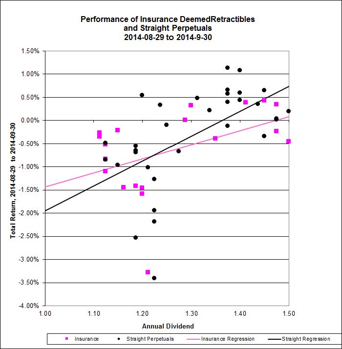
In August, insurance DeemedRetractibles underperformed bank DeemedRetractibles:

Click for Big
… and were about equal to Unregulated Straight Perpetuals.
Click for Big
Of the regressions shown in the above two charts, the Adjusted Correlation of the Bank DeemedRetractible performance is a mere 6%, Straight Perpetuals come in at 31% and Insurance DeemedRetractibles are at 17%.
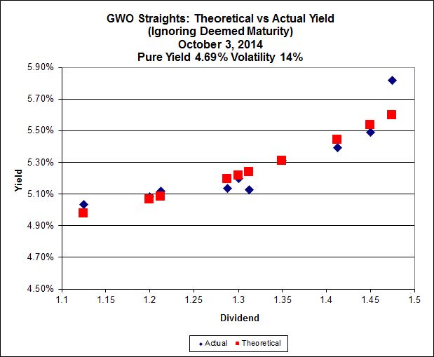
A lingering effect of the downdraft of 2013 has been the return of measurable Implied Volatility (all Implied Volatility calculations use bids from October 3):
Click for Big
Click for Big
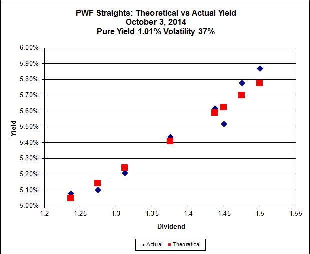
However, while the fit for PWF is good, all that can really be told from the data is that the Implied Volatility is high:

Click for Big
 >
>
Click for Big
Given that there are only three BNS straights left, it is no longer informative to calculate Implied Volatility.
| Implied Volatility of Two Series of Straight Perpetuals October 3, 2014 |
||
| Issuer | Pure Yield | Implied Volatility |
| GWO | 4.69% (+0.89) | 14% (-8) |
| PWF | 1.01% (+0.75) | 37% (-3) |
| Bracketted figures are changes since August month-end | ||
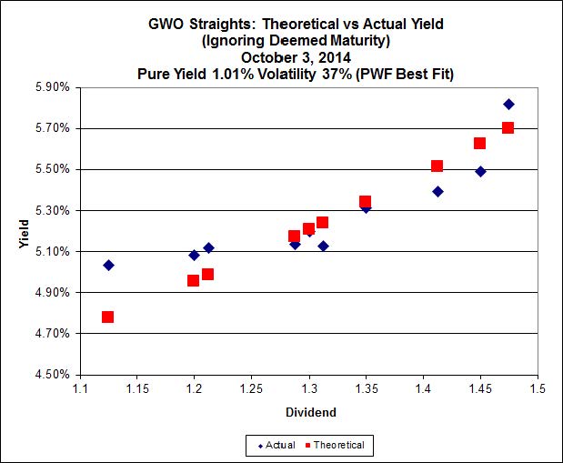
It is disconcerting to see the difference between GWO and PWF; if anything, we would expect the implied volatility for GWO to be higher, given that the DeemedRetraction – not yet given significant credence by the market – implies a directionality in prices. On the other hand, the PWF issues are mostly trading above par, which tends to add directionality. The GWO data with the best fit derived for PWF is distinguishable from the best fit; the best fit has a lower Sum of Squared Errors (1.56 vs. 3.53):
Click for Big
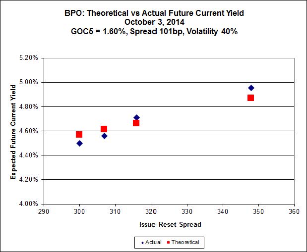
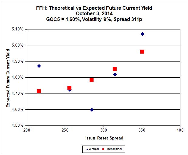
In the September, 2013, edition of PrefLetter, I extended the theory of Implied Volatility to FixedResets – relating the option feature of the Issue Reset Spreads to a theoretical non-callable Market Spread.
Click for Big
Click for Big
| Implied Volatility of Two Series of FixedResets August 29, 2014 |
||
| Issuer | Market Reset Spread (Non-Callable) |
Implied Volatility |
| BPO | 101bp (-5) | 40% (0) |
| FFH | 311bp (+7) | 9% (+1) |
| Bracketted figures are changes since July month-end | ||
These are very interesting results: The BPO issues are trading as if calls are a certainty, while FFH issues are trading as if calls are much less likely; this is probably due to the market’s over-reacting to the fact that all of the BPO issues are trading above par, while only one of the five FFH issues shares that happy status. The FFH series continues to be perplexing, this time with the four lower-coupon issues showing virtually no implied volatility – with the highest coupon issue (FFH.PR.K) being well off the mark … all I can think of is that the market has decided that FFH.PR.K, with an Issue Reset Spread of 351bp, is sure to be called in 2017, while the other four (highest spread is FFH.PR.C, +315) are not at all likely to be called.
Those of you who have been paying attention will remember that in a “normal” market (which we have not seen in well over a year) the slope of this line is related to the implied volatility of yields in Black-Scholes theory, as discussed in the January, 2010, edition of PrefLetter. As has been previously noted, very high levels of Implied Volatility (in the 40% range, at which point the calculation may be considered virtually meaningless) imply a very strong expectation of directionality in future prices – i.e, an expectation that all issues will be redeemed at par.
It is significant that the preferred share market knows no moderation. I suggest that a good baseline estimate for Volatility over a three year period is 15% but the observed figure is generally higher in a rising market and lower in a declining one … with, of course, a period of adjustment in between, which I suspect we are currently experiencing.
Sometimes everything works … sometimes it’s 50-50 … sometimes nothing works. The fund seeks to earn incremental return by selling liquidity (that is, taking the other side of trades that other market participants are strongly motivated to execute), which can also be referred to as ‘trading noise’ – although for quite some time, noise trading has taken a distant second place to the sectoral play on insurance DeemedRetractibles; something that dismays me, particularly given that the market does not yet agree with me regarding the insurance issues! There were a lot of strongly motivated market participants during the Panic of 2007, generating a lot of noise! Unfortunately, the conditions of the Panic may never be repeated in my lifetime … but the fund will simply attempt to make trades when swaps seem profitable, without worrying about the level of monthly turnover.
There’s plenty of room for new money left in the fund. I have shown in PrefLetter that market pricing for FixedResets is very often irrational and I have lots of confidence – backed up by my bond portfolio management experience in the markets for Canadas and Treasuries, and equity trading on the NYSE & TSX – that there is enough demand for liquidity in any market to make the effort of providing it worthwhile (although the definition of “worthwhile” in terms of basis points of outperformance changes considerably from market to market!) I will continue to exert utmost efforts to outperform but it should be borne in mind that there will almost inevitably be periods of underperformance in the future.
The yields available on high quality preferred shares remain elevated, which is reflected in the current estimate of sustainable income.
| Calculation of MAPF Sustainable Income Per Unit | ||||||
| Month | NAVPU | Portfolio Average YTW |
Leverage Divisor |
Securities Average YTW |
Capital Gains Multiplier |
Sustainable Income per current Unit |
| June, 2007 | 9.3114 | 5.16% | 1.03 | 5.01% | 1.3240 | 0.3524 |
| September | 9.1489 | 5.35% | 0.98 | 5.46% | 1.3240 | 0.3773 |
| December, 2007 | 9.0070 | 5.53% | 0.942 | 5.87% | 1.3240 | 0.3993 |
| March, 2008 | 8.8512 | 6.17% | 1.047 | 5.89% | 1.3240 | 0.3938 |
| June | 8.3419 | 6.034% | 0.952 | 6.338% | 1.3240 | $0.3993 |
| September | 8.1886 | 7.108% | 0.969 | 7.335% | 1.3240 | $0.4537 |
| December, 2008 | 8.0464 | 9.24% | 1.008 | 9.166% | 1.3240 | $0.5571 |
| March 2009 | $8.8317 | 8.60% | 0.995 | 8.802% | 1.3240 | $0.5872 |
| June | 10.9846 | 7.05% | 0.999 | 7.057% | 1.3240 | $0.5855 |
| September | 12.3462 | 6.03% | 0.998 | 6.042% | 1.3240 | $0.5634 |
| December 2009 | 10.5662 | 5.74% | 0.981 | 5.851% | 1.1141 | $0.5549 |
| March 2010 | 10.2497 | 6.03% | 0.992 | 6.079% | 1.1141 | $0.5593 |
| June | 10.5770 | 5.96% | 0.996 | 5.984% | 1.1141 | $0.5681 |
| September | 11.3901 | 5.43% | 0.980 | 5.540% | 1.1141 | $0.5664 |
| December 2010 | 10.7659 | 5.37% | 0.993 | 5.408% | 1.0298 | $0.5654 |
| March, 2011 | 11.0560 | 6.00% | 0.994 | 5.964% | 1.0298 | $0.6403 |
| June | 11.1194 | 5.87% | 1.018 | 5.976% | 1.0298 | $0.6453 |
| September | 10.2709 | 6.10% Note |
1.001 | 6.106% | 1.0298 | $0.6090 |
| December, 2011 | 10.0793 | 5.63% Note |
1.031 | 5.805% | 1.0000 | $0.5851 |
| March, 2012 | 10.3944 | 5.13% Note |
0.996 | 5.109% | 1.0000 | $0.5310 |
| June | 10.2151 | 5.32% Note |
1.012 | 5.384% | 1.0000 | $0.5500 |
| September | 10.6703 | 4.61% Note |
0.997 | 4.624% | 1.0000 | $0.4934 |
| December, 2012 | 10.8307 | 4.24% | 0.989 | 4.287% | 1.0000 | $0.4643 |
| March, 2013 | 10.9033 | 3.87% | 0.996 | 3.886% | 1.0000 | $0.4237 |
| June | 10.3261 | 4.81% | 0.998 | 4.80% | 1.0000 | $0.4957 |
| September | 10.0296 | 5.62% | 0.996 | 5.643% | 1.0000 | $0.5660 |
| December, 2013 | 9.8717 | 6.02% | 1.008 | 5.972% | 1.0000 | $0.5895 |
| March, 2014 | 10.2233 | 5.55% | 0.998 | 5.561% | 1.0000 | $0.5685 |
| June | 10.5877 | 5.09% | 0.998 | 5.100% | 1.0000 | $0.5395 |
| September, 2014 | 10.4601 | 5.28% | 0.997 | 5.296% | 1.0000 | $0.5540 |
| NAVPU is shown after quarterly distributions of dividend income and annual distribution of capital gains. Portfolio YTW includes cash (or margin borrowing), with an assumed interest rate of 0.00% The Leverage Divisor indicates the level of cash in the account: if the portfolio is 1% in cash, the Leverage Divisor will be 0.99 Securities YTW divides “Portfolio YTW” by the “Leverage Divisor” to show the average YTW on the securities held; this assumes that the cash is invested in (or raised from) all securities held, in proportion to their holdings. The Capital Gains Multiplier adjusts for the effects of Capital Gains Dividends. On 2009-12-31, there was a capital gains distribution of $1.989262 which is assumed for this purpose to have been reinvested at the final price of $10.5662. Thus, a holder of one unit pre-distribution would have held 1.1883 units post-distribution; the CG Multiplier reflects this to make the time-series comparable. Note that Dividend Distributions are not assumed to be reinvested. Sustainable Income is the resultant estimate of the fund’s dividend income per current unit, before fees and expenses. Note that a “current unit” includes reinvestment of prior capital gains; a unitholder would have had the calculated sustainable income with only, say, 0.9 units in the past which, with reinvestment of capital gains, would become 1.0 current units. |
||||||
| DeemedRetractibles are comprised of all Straight Perpetuals (both PerpetualDiscount and PerpetualPremium) issued by BMO, BNS, CM, ELF, GWO, HSB, IAG, MFC, NA, RY, SLF and TD, which are not exchangable into common at the option of the company (definition refined in May, 2011). These issues are analyzed as if their prospectuses included a requirement to redeem at par on or prior to 2022-1-31 (banks) or 2025-1-31 (insurers and insurance holding companies), in addition to the call schedule explicitly defined. See OSFI Does Not Grandfather Extant Tier 1 Capital, CM.PR.D, CM.PR.E, CM.PR.G: Seeking NVCC Status and the January, February, March and June, 2011, editions of PrefLetter for the rationale behind this analysis. | ||||||
| Yields for September, 2011, to January, 2012, were calculated by imposing a cap of 10% on the yields of YLO issues held, in order to avoid their extremely high calculated yields distorting the calculation and to reflect the uncertainty in the marketplace that these yields will be realized. From February to September 2012, yields on these issues have been set to zero. All YLO issues held were sold in October 2012. | ||||||
Significant positions were held in DeemedRetractible, SplitShare and FixedReset issues on August 29; all of these currently have their yields calculated with the presumption that they will be called by the issuers at par prior to 2022-1-31 (banks) or 2025-1-31 (insurers and insurance holding companies) or on a different date (SplitShares). This presents another complication in the calculation of sustainable yield. The fund also holds positions in various SplitShare issues which also have their yields calculated with the expectation of a maturity at par.
I no longer show calculations that assume the conversion of the entire portfolio into PerpetualDiscounts, as the fund has only a small position in these issues.
I will also note that the sustainable yield calculated above is not directly comparable with any yield calculation currently reported by any other preferred share fund as far as I am aware. The Sustainable Yield depends on:
i) Calculating Yield-to-Worst for each instrument and using this yield for reporting purposes;
ii) Using the contemporary value of Five-Year Canadas (set at 1.61% for the September 30 calculation) to estimate dividends after reset for FixedResets.
Most funds report Current Yield. For instance, ZPR reports a “Dividend Yield” of 4.5% as of August 29, 2014, but this is the Current Yield, a meaningless number. The Current Yield of MAPF was 4.89% as of August 29, but I will neither report that with any degree of prominence nor take any great pleasure in the fact that it’s a little higher than the ZPR number. It’s meaningless; to discuss it in the context of portfolio reporting is misleading.
However, BMO has taken a significant step forward in that they are no longer reporting the “Portfolio Yield” directly on their website; the information is taken from the “Enhanced Fund Profile” which is available only as a PDF link. CPD doesn’t report this metric on the CPD fact sheet or on their website. I may have one less thing to mock the fundcos about!
It should be noted that the concept of this Sustainable Income calculation was developed when the fund’s holdings were overwhelmingly PerpetualDiscounts – see, for instance, the bottom of the market in November 2008. It is easy to understand that for a PerpetualDiscount, the technique of multiplying yield by price will indeed result in the coupon – a PerpetualDiscount paying $1 annually will show a Sustainable Income of $1, regardless of whether the price is $24 or $17.
Things are not quite so neat when maturity dates and maturity prices that are different from the current price are thrown into the mix. If we take a notional Straight Perpetual paying $5 annually, the price is $100 when the yield is 5% (all this ignores option effects). As the yield increases to 6%, the price declines to 83.33; and 83.33 x 6% is the same $5. Good enough.
But a ten year bond, priced at 100 when the yield is equal to its coupon of 5%, will decline in price to 92.56; and 92.56 x 6% is 5.55; thus, the calculated Sustainable Income has increased as the price has declined as shown in the graph:

Click for Big
The difference is because the bond’s yield calculation includes the amortization of the discount; therefore, so does the Sustainable Income estimate.
Different assumptions lead to different results from the calculation, but the overall positive trend is apparent. I’m very pleased with the long-term results! It will be noted that if there was no trading in the portfolio, one would expect the sustainable yield to be constant (before fees and expenses). The success of the fund’s trading is showing up in
- the very good performance against the index
- the long term increases in sustainable income per unit
As has been noted, the fund has maintained a credit quality equal to or better than the index; outperformance has generally been due to exploitation of trading anomalies.
Again, there are no predictions for the future! The fund will continue to trade between issues in an attempt to exploit market gaps in liquidity, in an effort to outperform the index and keep the sustainable income per unit – however calculated! – growing.
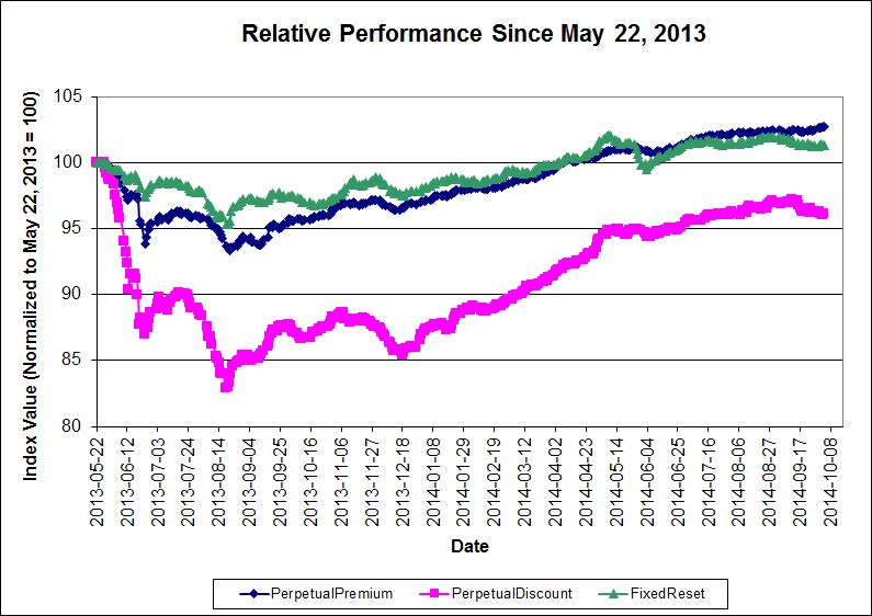
“I continue to believe that the decline in the preferred share market remains overdone; the following table shows the increase in yields since May 22, 2013, of some fixed income sectors:”
What is so special about May 22, 2013 that it should be the benchmark?
You mention the change in mix with regards to perp discounts, has the fixed reset category not seen any changes in its composition?
All the while aknowledging that you likely forget more about prefs daily than I’ll ever know, this market does not look cheap to me.
What is so special about May 22, 2013 that it should be the benchmark?
That was basically the peak of the market (the precise date will vary according to how you calculate the daily market Total Return Index Value). This was followed by the “Taper Tantrum”, in which preferreds got hammered due to fears of exploding policy rates.
You mention the change in mix with regards to perp discounts, has the fixed reset category not seen any changes in its composition?
I assume you are referring to my note in the table headed “Yield Changes”.
Yes, all indices have been changing constantly, with new issues and calls for redemption and – in the case of bonds – long-term issues falling out of that index and moving to the mid-term. However, the qualitative changes in the PerpetualDiscount index are so egregious that a straight comparison without an asterisk would be misleading.
this market does not look cheap to me.
It takes two to make a market! I’m calling it cheap because of
(i) the changes over the past sixteen months, with preferred yields rising far more than those of bonds and,
(ii) the consequent increase in the Seniority Spread.
Thanks for the responses even if the questions were taken a little too literally.
How have the spreads done when compared to the lows of the taper fears? The lows are just as valid a comparison point as the highs, both are just as artificial and self serving.
Indeed I was referring to that note. The fixed reset differential jumps out at the reader but as you pointed out in your most recent entry, the duration back then was far diferrent with loads of high issue resets acting as short term pseudo GICs. NVCC intros combined with some downgrades have also affected credit quality.
I think it paints a rather rosy picture. That being said, you’ve been saying something similar for a long time and I can’t very well defend the timing of my comment.
How have the spreads done when compared to the lows of the taper fears?
The Seniority Spread (equal to the difference between interest-equivalent PerpetualDiscounts and Long Corporate Bonds) is, according to the table, 252bp. This is very much at the high end of historical ranges – even above the immediate post-crisis levels about 200bp, although the plateau of about 250bp seems fairly stable for some time.
I publish a graph of the historical Seniority Spread every month in PrefLetter, to which you can subscribe for the low, low price of only $209.05 per year. That’s right, only $209.05! Sign up for your subscription now! My server is standing by!
The fixed reset differential jumps out at the reader but as you pointed out in your most recent entry, the duration back then was far diferrent with loads of high issue resets acting as short term pseudo GICs.
That may be part of the change. Certainly, it’s very hard to rationalize the relative move without referencing the change in characteristics of FixedResets. In addition, it may be that FixedResets were extremely expensive on May 22, 2013; certainly the portfolios I manage were all very underweight then.
I can’t very well defend the timing of my comment.
It’s very difficult to defend market timing, which is what I think you’re saying by “this market does not look cheap to me.” I gave up on market timing years ago. I have no idea whether the preferred share market is rich to cash or cheap to cash … I just look at relative value and long-term asset-class characteristics.
It seems like the seniority spread has been above 240 for the entire 16 month period. As for buying a 2nd copy of prefletter monthly, I’ll pass. 😉
Sorry if my reference to spreads was confusing, I was referring to the interest equivalent yield difference when compared to the taper lows.
“I gave up on market timing years ago.”
Understood. Telling readers something is cheap(or overdone) inherently has market timing implications. When compared to market highs, everything looks cheap!
Don’t wish to take more of your time with what is but a minor quibble.
Telling readers something is cheap(or overdone) inherently has market timing implications.
Yes, the line between security rich/cheap analysis and market timing is broad, blurred and grey! While I am willing to opine on the relative merits of long-term corporate bonds and preferred shares, I get more hesitant with increasing differences between two assets. Cash vs. any investment class is too much of a stretch!